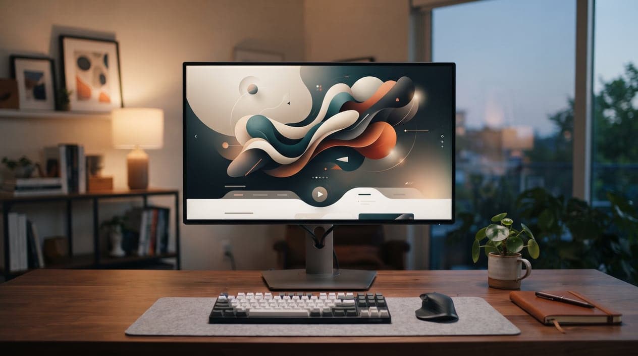
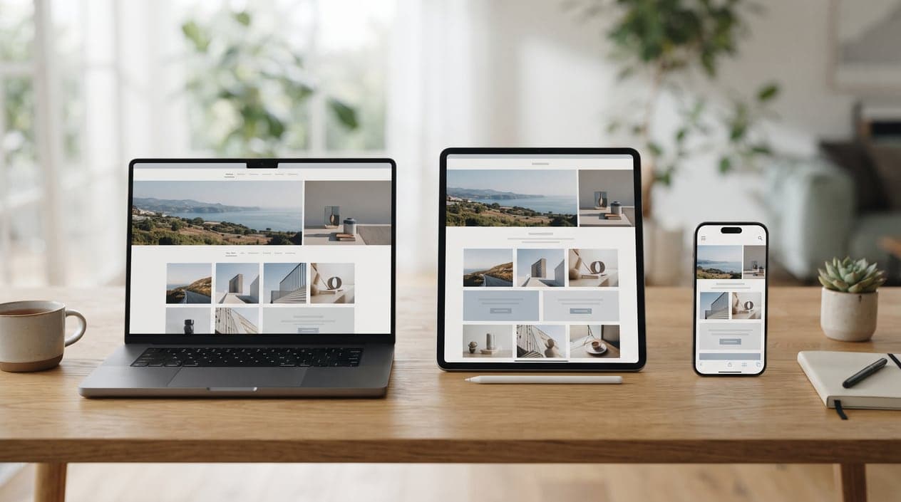
People access websites from a wide range of devices, making a consistent experience essential for any modern business. Professional Website Design ensures your website adapts to different screen sizes while maintaining clear navigation, readable content, and reliable functionality. Expert Website Design services combine responsive layouts, intuitive interfaces, and thoughtful design to create a seamless experience for visitors on desktops, tablets, and smartphones.
A website that works well on one device but feels difficult to use on another can create unnecessary frustration. Responsive design addresses this challenge by adapting page elements and content to different screen dimensions without sacrificing usability or visual consistency.
Responsive Layouts for Different Screen Sizes
Responsive Website Design allows pages to adjust naturally across desktops, tablets, and smartphones. Content, images, menus, and other elements are structured to remain accessible and easy to interact with regardless of screen size.
A flexible layout helps visitors navigate your website comfortably without constantly zooming, scrolling awkwardly, or searching for important information.
Navigation Designed for Easy Interaction
User experience depends heavily on how easily visitors can move through a website. Clear menus, logical page structures, readable headings, and accessible navigation help users find what they need efficiently.
Thoughtful navigation creates a smoother experience and allows visitors to explore your business without unnecessary barriers.
Consistent Branding Across Devices
Your website should communicate the same professional identity regardless of how someone accesses it. Consistent colors, typography, imagery, messaging, and visual elements help maintain brand recognition across different devices.
Professional Website Design ensures responsive changes do not compromise the overall appearance or identity of your business.
Performance That Supports Better Experiences
A responsive website should also perform efficiently. Optimized images, streamlined layouts, accessible content, and efficient functionality contribute to smoother browsing experiences.
When visitors can access information quickly and interact with your website easily, they are more likely to continue exploring your services.
Frequently Asked Questions
What is responsive Website Design?
Responsive Website Design adapts website layouts and content to different screen sizes, allowing visitors to use the site comfortably across desktops, tablets, and smartphones.
Why is mobile-friendly design important?
Mobile-friendly design ensures visitors can easily read content, navigate pages, and interact with your website regardless of the device they use.
Can responsive design improve user experience?
Yes. Responsive layouts create a more consistent and accessible experience by adapting website elements to different screen sizes.
Does responsive Website Design affect business credibility?
Yes. A website that functions smoothly across devices demonstrates professionalism and makes it easier for visitors to interact with your business.