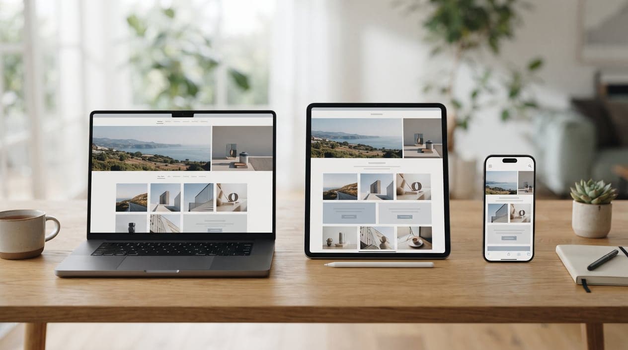

“Above the fold” is an old newspaper term for what you see before you unfold the paper. On a website it means the first screen, before anyone scrolls. On a phone that's a small rectangle, and it decides whether a visitor stays or goes back to Google.
Too many local business sites spend that space on a slideshow, a slogan that could belong to anyone, or a huge photo with no words on it. Here's what we put there instead.
Say What You Do and Where You Do It
Plain words beat clever ones. “Roof repair and replacement in the San Fernando Valley” tells a visitor in two seconds that they're in the right place. “Elevating your living experience” tells them nothing at all.
Write the headline for the customer who just searched. If your top service and your main area are in it, you've already answered their first two questions.
Put the Phone Number Where a Thumb Can Reach It
On a phone, the call button should be visible without scrolling and easy to tap. Many sites keep a call button fixed at the bottom of the screen on mobile, and it's a good idea. If most of your customers book online instead, make the booking button the obvious one.
Show One Strong Piece of Proof
Pick the proof that matters most to your customers: your star rating and review count, years in business, a license number, or a client people recognize. One clear line of proof works better than a row of badges nobody reads.
Offer One Clear Next Step
Give visitors one main action, like “Call now” or “Get a free estimate,” and at most one quieter option, like “See our work.” When the first screen has five buttons, people often pick none of them.
Use a Real Photo
A photo of your team, your shop or a finished job usually earns more trust than a stock photo of people shaking hands. It doesn't need to be perfect. It needs to look like your business.
Make It Load Fast
Speed is part of the first impression. Big sliders, autoplay videos and oversized images can leave a phone showing a blank screen while the page loads, and plenty of visitors won't wait. Compress your images, keep the first screen simple and test the page on a real phone over a cellular connection.
Test It Like a Customer
Hand your phone to someone who doesn't know your business, open the homepage and give them five seconds. Then ask: what do we do, where do we work, and how would you contact us? If they can't answer all three, start there.
Want to see how we handle this for different kinds of businesses? Our portfolio has examples, and our website design service covers the whole process, from the first screen to the last.
Frequently Asked Questions
Do sliders or carousels help?
Rarely. Few visitors wait around for the second slide, and carousels can slow the page down. One strong message beats five rotating ones.
Should my homepage include prices?
If you have standard prices, a starting price can filter out poor-fit leads. For custom work, a line about free estimates or what affects the price works better than saying nothing.
How long should a homepage be?
As long as it needs to be. The first screen does the selling. The rest answers the questions people have before calling: services, areas, proof, how the process works and common questions.
Is a chat widget worth having?
It can be, if someone actually replies quickly. A chat nobody answers is worse than no chat at all. Make sure it doesn't cover your call button on phones.